Deforestation in Borneo: a GIS case study
Dec 15, 2019
Smooth animated maps and fast ways to calculate geographical distances in R.
TL;DR
- The
tweenrlibrary creates smooth animations by interpolating data points. However, its data format makes it tricky to use for (raster) maps; - the
veloxpackage dramatically improves rasterisation speeds for shape files as well as for a small number of related operations; - By using efficient nearest-neigbour calculations, it is possible to compute complex distance calculations orders of magnitude faster than using the usual
raster::bufferorraster::distance; - Forest loss is catastrophic in some parts of the Sabah district of Borneo, and is driven by proximity to roads;
- Protected areas have been so far largely shielded from deforestation in this region.
Introduction
We focus on the Sabah region of Malaysia on the island of Borneo. The area produces excellent tea (which is how I got to know it), but is also subject to intense deforestation, logging and mining. For this analysis, I will use the study of deforestation from the years 2000 to 2018 to introduce some nice methods for fast distance calculation on geographical rasters.
Getting to know Sabah
We extract Sabah and its administrative districts using the maptools package, and generate a nice plot:
library(maptools)
library(raster)
adm=getData('GADM', level=2, country="Malaysia")

plot(adm[adm$NAME_1=="Sabah",])
text(coordinates(adm), adm$NAME_2)

tongod=adm[adm$NAME_2=="Tongod",]
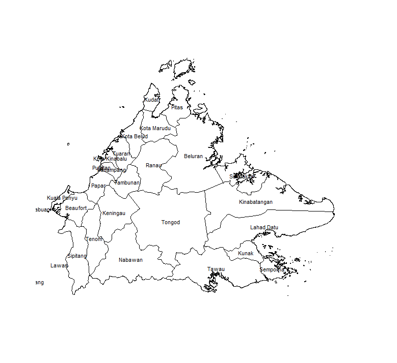
For the remainder of this post, we will focus on the central Tongod district.
The administrative region data is a polygon dataset. To study forest cover and loss, we will use the renowned Hansen dataset, which is freely available online in raster form. While shape files can be thought of as vector images describing abstract geometric shapes, rasters are pixellated images of a map, where each pixel’s color represents a value of interest: elevation, presence of a species, or indeed, percentage of tree cover. We need to transform the polygons to align them with the projection used for the forest cover datasets. We get the 2000 tree cover data from this address:
gc()
library(rgdal)
cover00=raster("K:/Downloads/Hansen_GFC-2017-v1.5_treecover2000_10N_110E.tif")
proj=projection(cover00)
tongod=spTransform(tongod, CRS(proj))
You can also use the convenient gfcanalysis package to automatically download the Hansen files you need:
library(gfcanalysis)
tiles=calc_gfc_tiles(tongod)
data_folder='.'
download_tiles(tiles, data_folder)
and so on as per the package’s help page.
We don’t use it because it slows things down by using files at every step. Since we are not in th 90’s anymore, we opt for an approach that does most operations on the fly in memory. These datasets are huge and not practical to work with at this scale. We first crop, then subset the tree cover datasets to the Tongod region. We use the fantastic package velox that speeds things up by an order of magnitude:
gc()
library(velox)
cover00.tongod.ext=crop(cover00,extent(tongod))
blank=cover00.tongod.ext
values(blank)=0
vx=velox(blank)
vx$rasterize(tongod, "ID_1")
blank=vx$as.RasterLayer()
values(blank)[values(blank)==0]=NA
values(blank)[!is.na(values(blank))]=values(cover00.tongod.ext)[!is.na(values(blank))]

# this thresholds the raster at 80% coverage
values(blank)[values(blank)<0.8]=0
values(blank)[values(blank)>0.8]=1
Visualising loss per year
Now we load the forest cover loss per year:
gc()
loss=raster("K:/Downloads/Hansen_GFC-2017-v1.5_lossyear_10N_110E.tif")
loss.tongod.ext=crop(loss, extent(tongod))
We use the animation library and its helpful saveGIF function. We also downsample the raster to make calculations and plotting faster:
library(animation)
library(RColorBrewer);
library(data.table)

smaller=aggregate(blank, 5, FUN=min)

gc()
loss.tongod.smaller=aggregate(loss.tongod.ext, 5, FUN=min)
saveGIF({
    plot(smaller, box=F,legend=F, axes=F,col=brewer.pal(10, "Greens"));
    mtext("2000", cex=2, line=2);
    for(i in 2:18){
        test=smaller;
        values(test)[values(loss.tongod.smaller)<i & values(loss.tongod.smaller)>0]=0;
        plot(test, box=F,legend=F, axes=F,col=brewer.pal(10, "Greens"));
        mtext(2000+i-1, cex=2, line=2)
    }
},ani.width=800, ani.height=800, interval=0.2)
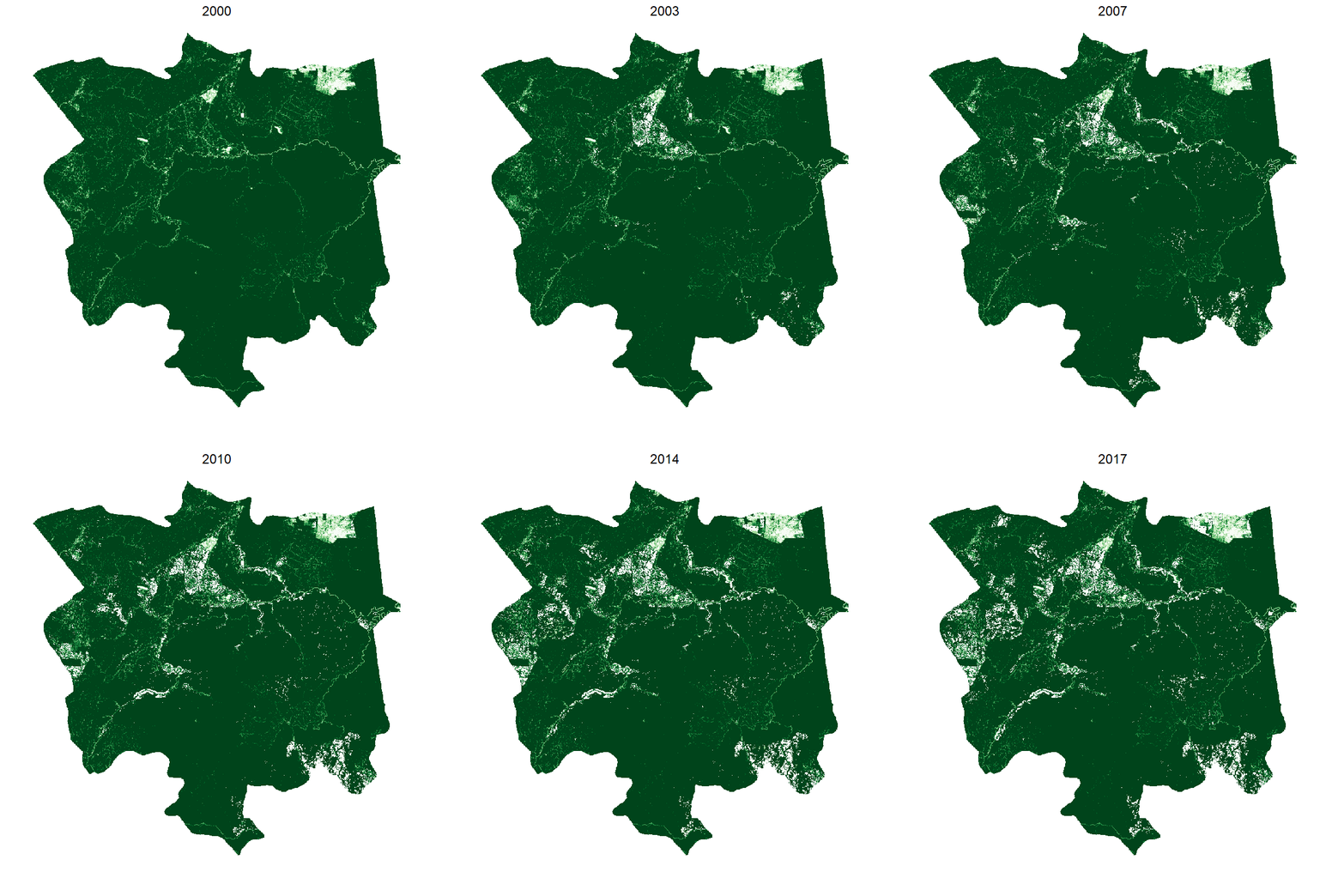
This gives the following:

Making it smooth with tweenr
Currently we have a choppy image. But we can interpolate if we want smoother transitions. For this we use the tweenr library. Unfortunately, it can’t work with matrices, so we have to do some data wrangling to convert it to a data table. Beware, this takes time and memory:
## create an initial data table for year 2000 containing tree cover
df=as.data.table(coordinates(smaller))
df$id=paste(df$x,df$y)
df$value=values(smaller)
df$x=NULL;df$y=NULL;df$year=00
df=df[!is.na(df$value),]

## for each subsequent year, we append that year's loss data to the data table
for(i in 16:0){
    gc()
    print(i);
    flush.console();
    coveri=smaller;
    values(coveri)[!is.na(values(coveri)) & values(loss.tongod.smaller)>0 & values(loss.tongod.smaller)<(18-i)]=0;
    plot(coveri)
    dfapd=as.data.table(coordinates(coveri));
    dfapd[, id:=do.call(paste,.SD), .SDcols=c("x","y")];
    dfapd$value=values(coveri);
    dfapd$x=NULL;dfapd$y=NULL;
    dfapd=dfapd[!is.na(dfapd$value),]
    dfapd$year=17-i;
    df=rbind(df,dfapd)
}

## this is the "ease" parameter that defines how values are interpolated.
df$ease="linear"


## We interpolate between 2000 and 2001
interp=tween_elements(df[df$year %in% c(0,1),], "year", group="id", ease="ease", nframes=5)
interp=as.data.table(interp)
interp[,c("x", "y") := tstrsplit(.group, " ", fixed=T)]
interp$x=as.numeric(interp$x)
interp$y=as.numeric(interp$y)
interpadd=interp

## We add it for every subsequent year
## Trying to do all years at the same time makes R crash
for(i in 1:17){
    print(i)
    flush.console()
    interp=tween_elements(df[df$year %in% c(i,i+1),], "year", group="id", ease="ease", nframes=5)
    interp$.frame=interp$.frame+i*5
    gc()
    interp=as.data.table(interp)
    interp[,c("x", "y") := tstrsplit(.group, " ", fixed=T)]
    interp$x=as.numeric(interp$x)
    interp$y=as.numeric(interp$y)
    interpadd=rbind(interpadd, interp)
}


titles=c(rep(2000,3), rep(2001:2016, each=5), rep(2017,3))
saveGIF({
    for(i in 0:85){
    print(i)
    flush.console()
    test=smaller
    gc()
    test[cellFromXY(test, interpaddu[interpaddu$.frame==2,c("x","y")])]=interpaddu$value[interpaddu$.frame==i]
    plot(test, box=F, legend=F, axes=F, col=brewer.pal(9, "Greens"))
    mtext(titles[i+1], cex=2, line=2)
}
}, ani.width=800, ani.height=800, interval=0.01)
Was it worth writing all that code just to have a smooth animation that shows exactly the same as before? You be the judge.
Total loss and protected areas
Let’s load protected areas, downloadable from the WDPA website, and crop it to the region:
wdpa=readOGR(dsn=".", "WDPA_Dec2019-shapefile-polygons")
wdpa=crop(wdpa, extent(tongod))
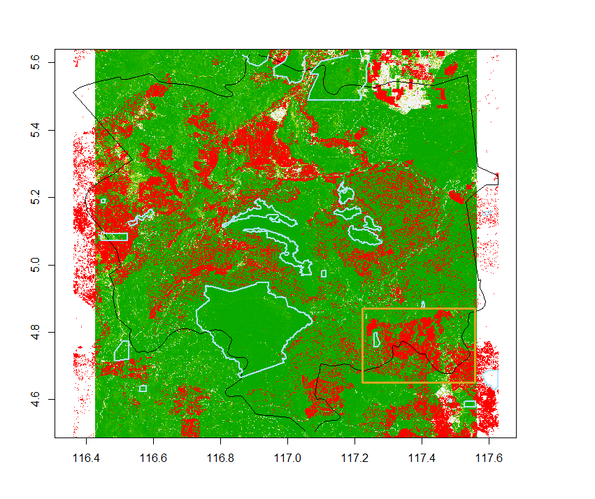
We replace the value 0 in the loss dataset with NA to make its background transparent. This way we can easily superimpose layers on one another.
loss.transp=loss.tongod.ext
values(loss.transp)[values(loss.transp)==0]=NA
plot(cover00.tongod.ext)
plot(loss.transp, add=T, col="red")
plot(tongod, add=T)
plot(wdpa, add=T)
Area of interest for fragmentation
When studying the impact of deforestation, we are often interested in how less “livable” the partially deforested areas have become for a species of interest. You may have seen dramatic images of orang utangs fighting against excavators. But logging does not happen uniformly at the forest’s border: some areas are easier to access than others, which can break up a previously continuous habitat and isolate patches of forest. This means that logging activities can cause the loss of an area much larger than the area actually deprived of trees. Fragmentation is one way to quantify this type of habitat loss.
From the plot above, we select an area where deforestation has had a big impact, where we will be able to study habitat fragmentation.
aoi.extent=extent(c(117.2, 117.5, 4.65, 4.87))
aoi.cover00=crop(cover00.tongod.ext, aoi.extent)
aoi.loss=crop(loss.transp, aoi.extent)

restrict.to.shape=function(raster, shape){
    library(velox)
    retraster=raster
    values(retraster)=NA
    vx=velox(retraster)
    vx$rasterize(shape, "ID_1")
    retraster=vx$as.RasterLayer()
    values(retraster)[!is.na(values(retraster))]=values(raster)[!is.na(values(retraster))]
    return(retraster)
}
aoi.cover00=restrict.to.shape(aoi.cover00, tongod)
aoi.loss=restrict.to.shape(aoi.loss, tongod)
plot(aoi.cover00)
plot(aoi.loss, add=T, col="red")
At this point let’s simplify a bit. Our habitat is going to be all areas covered at more than 80% by forest in 2000.
values(aoi.cover00)[values(aoi.cover00)>0.8]=1
values(aoi.cover00)[values(aoi.cover00)<0.8]=0
We incorporate 17-year loss to produce tree cover in 2018:
aoi.cover18=aoi.cover00
values(aoi.cover18)[!is.na(values(aoi.loss))]=0
Projections
SDMTools understands lat/lon coordinates, which the Hansen tree cover dataset uses, so we don’t need to transform our data. If we wanted to think in terms of square kilometers, we would need to project our dataset. Read about this here. To project, we need to know which zone we are in. According to this website, Sabah is in UTM Zone 50. We project:
newproj=CRS("+proj=utm +zone=50 +datum=WGS84")
aoi.cover00=projectRaster(aoi.cover00, crs=newproj)
aoi.cover18=projectRaster(aoi.cover18, crs=newproj)
res(aoi.cover00)
This tells us that we have a resolution of approximately 27.65m per pixel edge (30m at the equator). Because the projection does an average of the cell values, it’s better to do this early on, otherwise you will have to re-threshold the data.
Patch statistics
Then we calculate patch statistics:
library(SDMTools)
patchStats00=ClassStat(aoi.cover00, latlon=T)
patchStats18=ClassStat(aoi.cover18, latlon=T)
We can concentrate on a few key indicators. During these 17 years, 8 patches of forest with an average patch area of 66 km2 for a total of 528 km2 became 2,825 patches with an average area of 0.1 km2 and a total area of 318 km2. This represents a dramatic example of fragmentation and area loss.
Distance between patches
While it’s easy to get the distribution of areas for our 2,825 patches, computing shortest distance between patches is much harder, because the distance is minimised across all points of the edges of our patches.
Let’s see how we do it for areas: first we label the patches, then either run ClassStats as before, or even simpler, count the cells for each possible value with table:
values(aoi.cover18)[is.na(values(aoi.cover18))]=0
labelled.patches=ConnCompLabel(aoi.cover18)
labelled.stats=ClassStat(labelled.patches)
areas=labelled.stats$total.area
## or, simply
areas=table(values(labelled.patches))
hist(areas)
For distance between patches, we proceed a different way. We take advantage of the fact that if two patches are closer than \(\LARGE d\), then they will be merged if we extend a buffer of size \(\LARGE\frac{d}{2}\) around them. By studying the decrease in patch number with increasing buffer sizes, we can quantify the distribution of distances between patches.
increment=seq(1, 500, by=15) ## our cell dimension is about 30x30
npatch=NULL
values(aoi.cover18)[values(aoi.cover18)==0]=NA
for(margin in increment){
    buffered=buffer(aoi.cover18, increment)
    plot(buffered)
    stats=ClassStats(labelled.patches, latlon=T)
    npatch=c(npatch, stats$n.patches)
}
This is nice, but the buffer function is extremely slow. We can use a trick by using a faster algorithm. We convert the raster to two data frames: one contains the coordinates of forested points, the second of deforested points.
buffer.around.raster=function(raster, margin){
    library(RANN)
    df=coordinates(raster)
    df=as.data.frame(df)
    df$value=values(raster)
    one=df[!is.na(df$value),]
    two=df[is.na(df$value),]
    one$value=NULL
    two$value=NULL

    if(margin==0){
        return(raster)
    }
    test.d=nn2(one, two, k=1)
    test.buf=raster
    values(test.buf)=NA
    test.buf[cellFromXY(test.buf, one[, c("x", "y")])]=0
    test.buf[cellFromXY(test.buf, two[, c("x", "y")])]=test.d$nn.dist
    test.buf[values(test.buf)>margin]=NA
    test.buf[!is.na(values(test.buf))]=1
    return(test.buf)
}
We just change our previous bit of code to call the new function:
increment=seq(0, 500, by=15) ## our cell dimension is about 30x30
npatch=NULL
values(aoi.cover18)[values(aoi.cover18)==0]=NA

aoi.cover18.p=projectRaster(aoi.cover18, crs=newproj)
values(aoi.cover18.p)[!is.na(values(aoi.cover18.p))]=1

for(margin in increment){
    buffered=buffer.around.raster(aoi.cover18.p, margin)
    plot(buffered, main=paste("buffer =", margin))
    stats=ClassStat(buffered, latlon=F)
    npatch=c(npatch, stats$n.patches)
}

plot(npatch, type="b", xaxt="n", xlab="distance")
axis(seq(0, (length(npatch)-1)*15, by=15),side=1, at=1:length(npatch), las=2)
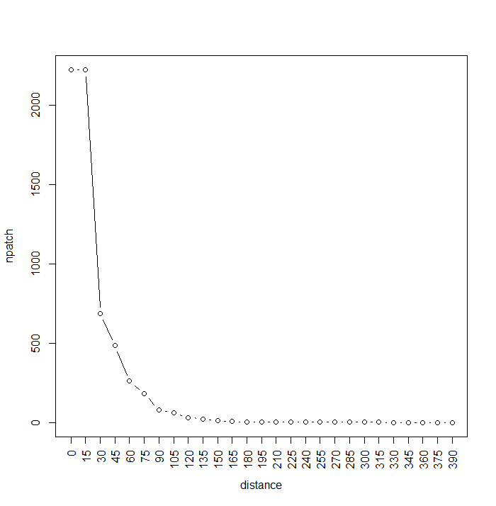
We can actually stop the calculation once we see that we’ve reached 1 giant patch. The graph shows us that many patches are fairly close to each other (<60m), while most are separated by less than 20m. Note that the max number of patches, now 2222, has been reduced by projection effects. This calculation would have taken about a day with the raster::buffer function, it takes about a minute using RANN:nn2.
Distance to feature
We can also very easily calculate the shortest distance of any point of a given class to any point of another class with the same trick. Let’s load the roads, which we get from GeoFabrik:
roads=spTransform(readOGR(dsn=".", "gis_osm_roads_free_1"), CRS=newproj)
roadmin=crop(roads, extent(aoi.cover18.p))
rm(roads) ## this takes up a lot of RAM
gc()
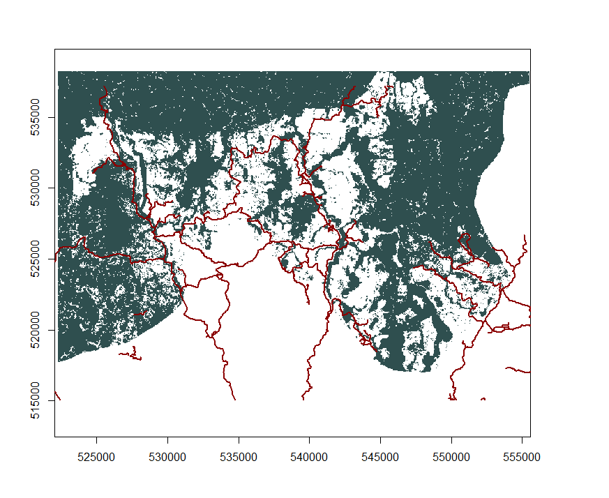
We rasterise them:
blank=aoi.cover18.p
values(blank)=NA
vx=velox(blank)
vx$rasterize(roadmin, "osm_id")
roads=vx$as.RasterLayer()
values(roads)[!is.na(values(roads))]=1
Now, we have two rasters, one containing the forested/deforested areas, the other one containing the roads. Let’s calculate the closest distance to a road across the entire region using the previously described trick:
df=coordinates(roads)
df=as.data.table(df)
df$value=values(roads)
road=df[!is.na(df$value),]
road$value=NULL

nonroad=df[is.na(df$value),]
nonroad$value=NULL

dist=nn2(road, nonroad, k=1)
dist.raster=roads
values(dist.raster)=NA
dist.raster[cellFromXY(dist.raster, road[, c("x", "y")])]=0
dist.raster[cellFromXY(dist.raster, nonroad[, c("x", "y")])]=dist$nn.dist
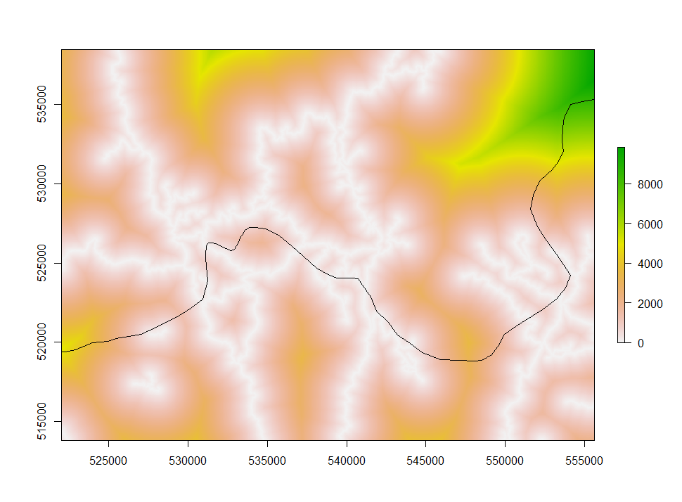
Deforestation as a function of distance
Do we see more deforestation in areas close to roads? In other words, are deforested areas closer to roads than non-deforested ones? We not have all the tools to answer that question:
# We regenerate aoi.cover18 to distinguish between out of AOI and deforested
aoi.cover18=aoi.cover00
values(aoi.cover18)[!is.na(values(aoi.loss))]=0
aoi.cover18.p=projectRaster(aoi.cover18, crs=newproj)
values(aoi.cover18.p)[!is.na(values(aoi.cover18.p)) & values(aoi.cover18.p)<0.5]=0
values(aoi.cover18.p)[!is.na(values(aoi.cover18.p)) & values(aoi.cover18.p)>0.5]=1

## get distance to road for each type of forestation
forested=values(dist.raster)[!is.na(values(aoi.cover18.p)) & values(aoi.cover18.p)==1]
deforested=values(dist.raster)[!is.na(values(aoi.cover18.p)) & values(aoi.cover18.p)==0]
boxplot(forested, deforested, names=c("forested", "deforested"), ylab="distance")
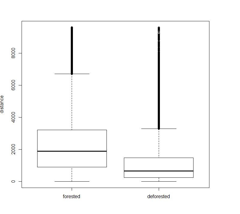
From this plot, we see a clear effect of road proximity on deforestation. This can be confirmed by a hypothesis test, such as the T-test (or another distribution comparison test, since the distance distributions are not guaranteed to be normal).
Share